If you’re new to web design, this free course on web design for beginners will teach you everything you need to know.
“How do I pick typefaces, how do I pick colors, what the heck is whitespace, and how do I position and size elements correctly?”
These are exactly the kinds of questions that we’ll address in this epic beginner web design course.
In terms of fundamentals, you’ll learn about color, typography, spacing, sizing, imagery, and responsive web design. We’ll discuss the theory, best practices, and some tools you can use to make your job easier.
When it comes to common web design patterns, you’ll learn about the elements you can use to design a web page—things like headers, hero areas, buttons, image galleries, contact forms, and more. For each of these patterns, we’ll look at the definition and some use cases, and then we’ll apply that knowledge to a demo project: a three-page portfolio website designed specifically for this course.
Web Design Assets on Envato Elements
You will find some of the best premium web templates on Envato Elements. These premium assets include high-quality features that make it fast and easy for you to design and build websites. With your Elements subscription, you’ll get unlimited access to UI kits, web templates, fonts, WordPress themes, and other useful stuff for any web designer.
This is a huge course (05:20 hours long) and it’s split into 36 lessons in total. You’ll find it’s a great resource to dip in and out of, and make sure you bookmark the bits you’re most interested in.
Download the project brief and course assignments so you can follow along, and check out the lesson contents below to see what’s covered in detail!
Introduction
1. Welcome to the Course!
So you want to become a web designer, but you have no idea where to start. Don’t panic! It’s not as hard as it seems, though it requires time and effort to learn. In this course, I will guide you through the basic steps of becoming a web designer. You’ll learn lots of great information, like the difference between UI and UX design or how to read project briefs and create wireframes. You’ll learn about typography, color, spacing, sizing, and using imagery.
The course also has a practical assignment you can take so you’ll be able to solidify the information you learn. Through this assignment, you’ll learn how to use some of the most common patterns in web design by creating a portfolio website.
2. Course Project and Assignment
Alright so as I’ve been saying previously, in this course we’ll be working on a demo project and there will also be an assignment. For you. Don’t think about it as homework because nobody likes doing that, but instead as an opportunity to take what you learned during the course and put it to good use, to practice, right?

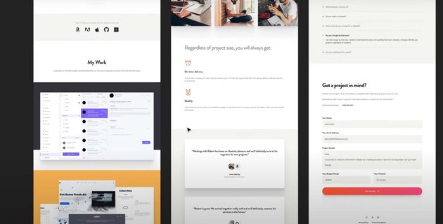
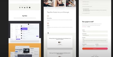
So first let me show you the course project and then we’ll talk a little bit about the assignment.
Related links:
3. UI Design vs. UX Design vs. Web Design
Alright so let’s see what’s up with all these acronyms. UI, UX, web designer… what’s their deal? How is a UI designer different from a UX designer? Are both of these web designers or is that something completely different? Let’s find out.
Project Briefs, Wireframes, and Tools
4. Learning to Work with Project Briefs
Every web design project should start with the UX part, right? The user experience — because that’s what we need to focus on. Before we even consider colors or fonts, we need a clear structure of the content and we need to know who we’re designing this for.
And this is where a project brief comes in very handy. So for this application, we’ll pretend we’re the UX designer and we just had a talk with the client. Based on that talk we created a project brief.
5. Working with Wireframes
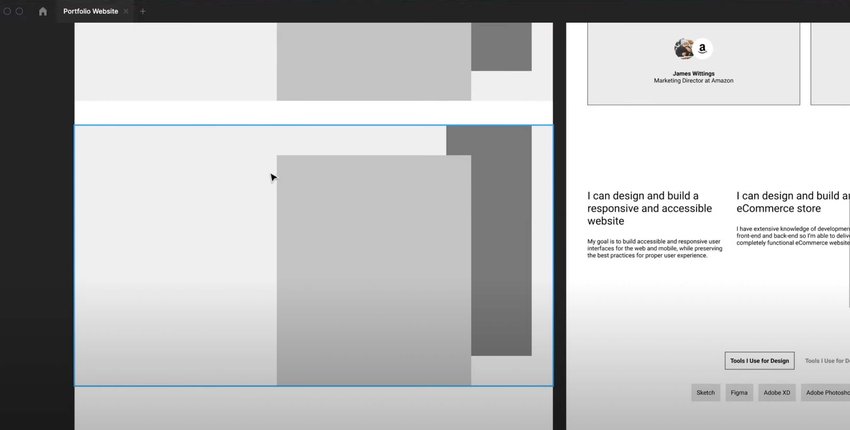
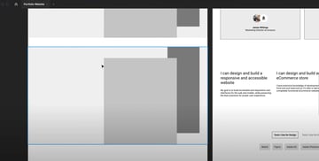
Alright, let’s talk about wireframes. These are low-fidelity versions of the final design. You can even think about them as sketches.
The idea with a wireframe is to display the final content as well as its structure. But do it in a way that overlooks any aesthetic decisions. Meaning, a wireframe is not about colors or typefaces or spacing. It’s purely about the content, how that content flows and how it’s organized.
Now, coming back to our project, we’re still on the UX side. Right? We’re still looking at things from the user’s perspective and because we have a project brief ready to go we can get started on the wireframe.
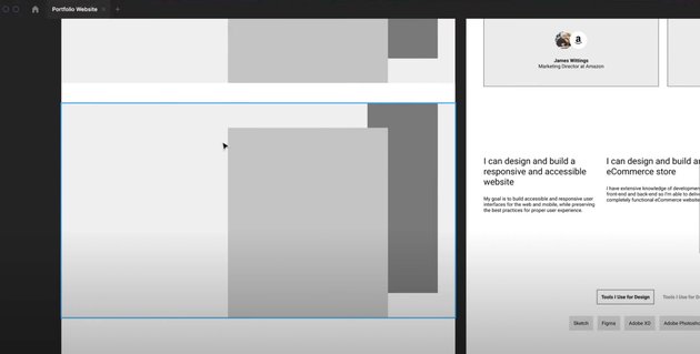
To save a bit of time, I went ahead and created the wireframe so now I’ll walk you through it.
6. Picking the Right Design Tool
Alright so as we’re slowly getting into the UI design part of this course, it’s time to decide which software we’ll be using moving forward and I’m sure this is one of the main questions you’re asking yourself as a beginner.
And while it’s relatively easy to learn a UI design software, it’s always helpful to know about the pros and cons before you begin so that you have the best information available when making the decision.
Related links:
Fundamentals: Color & Accessibility
7. Color Theory
When it comes to color theory, there is a lot of information and if you did design work before, then you probably know the basics. But just in case you don’t or maybe you need a refresh, this lesson is all about that.
I’ll try and give you a very quick guide to using colors in web design, without making it very complicated. Let’s go.
8. Color Harmonies, Psychology, and Tools
Working with color can be daunting at times, especially as a beginner because, sure, you know the theory, but how do you put it into practice? How do you pick colors that work best for your project and also work very well together?
To answer that, let’s begin by exploring color psychology or the meaning of color.
Related links:
9. Creating a Color Palette for Our Project
Alright so now we’re in the realm of UI design. We have a project brief, we have a wireframe, and a pretty clear direction. Now it’s our job to create a design based on that wireframe and the easiest place to start is the color palette.
Fundamentals: Typography
10. Let’s Talk About Typography
Arguably, typography is the most important part of any design because most of the content is usually text. So if you’re not using the appropriate typefaces, font sizes, line heights, font weights, and so on, everything else kinda just falls apart.
It doesn’t matter how good-looking the rest of the website is. If your typography looks bad, that’s going to translate to the whole thing.
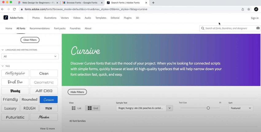
So how do you get started with typography? Well, there’s a multi-step process and I’m going to try and simplify it for you. It all starts with choosing where you get your fonts from.
Related links:
11. Creating the Typography for Our Project
Alright so let’s follow the steps I described previously and pick the right typography characteristics for our project. Let’s go.
Related links:
Fundamentals: Spacing, Sizing, and Imagery
12. Spacing and Sizing in Web Design
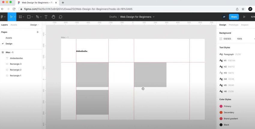
Alright, spacing and sizing in web design. This refers to how much space you should use inside and outside of elements and also how big or small they should be. And these will sometimes overlap because the final size of an element can also be dictated by the interior spacing, like for example, a button.

Related links:
13. Using Icons and Images in Web Design
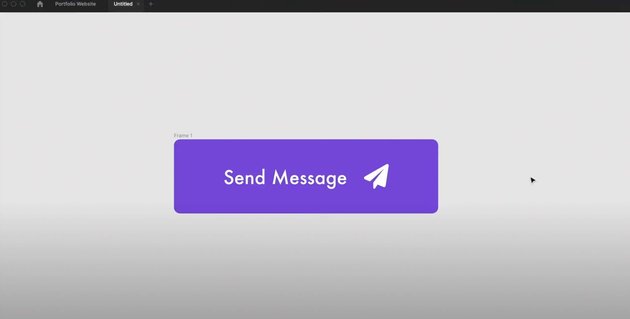
Before we start putting pixels on the screen, I want to give you a few pointers for working with icons and images.
Don’t forget to check out Envato Elements for unlimited use of thousands of creative assets—including icons for web design!

Related links:
Common Patterns: Headers, Hero Areas, and Buttons
14. Definition and Use Cases for Headers
Before we design a header, let’s look at what it is.
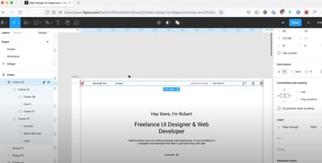
15. Let’s Design a Header
To design our header we’ll use the wireframe as a starting point and because I’m working in Figma I’ll be using the auto-layout feature pretty heavily. But don’t worry, I’ll explain how it works as we’re building stuff with it.


Related links:
16. Definition and Use Cases for Hero Areas
Hero sections were once considered to be a passing trend but they actually stuck very well in web design and pretty much all websites nowadays use one.
17. Let’s Design a Hero Area
Ok, previously we designed the header for the website of Robert Fox. And if we look at the wireframe, right below that we have a hero section. So let’s take that and work our magic.
18. Definition and Use Cases for Buttons
I think everybody knows by now what a button is. But just in case, let’s do a recap.
19. Let’s Design Some Buttons
My hero area is incomplete at the moment because I need to design the button. So while I do that I’ll also give you some tips and tricks for designing good-looking buttons. Let’s go.
Common Patterns: Image Galleries
20. Definition and Use Cases for Image Galleries
Alright, let’s talk about image galleries and I think the name is pretty self-explanatory.
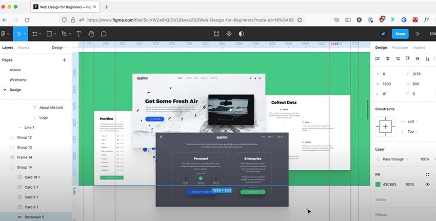
21. Let’s Design an Image Gallery
Based on the wireframe, our website also has an image gallery even tho it’s more like a portfolio showcase. But we’re only displaying images there so can safely categorize it as an image gallery.

Common Patterns: Footers
22. Definition and Use Cases for Footers
Alright, time to work with footers but first, let’s try and define them.
23. Let’s Design the Footer
Alright, time to get busy again and use our massive knowledge of footers to create our very own. Ready?
Common Patterns: Testimonials
24. Definition and Use Cases for Testimonials
Alright, testimonials. What are they? Well, they’re basically nice things that your clients say about you. You the business, the brand.
25. Let’s Design some Testimonials
Alright, so our website has 2 places for testimonials: the homepage and the about page. And we’ll use a slightly different style between the 2 pages.
Common Patterns: Tab Controls
26. Definition and Use Cases for Tabs
Alright, let’s talk about tabs. I’m sure most of you know what a tab control is by now, but just in case you don’t, here’s a quick definition.
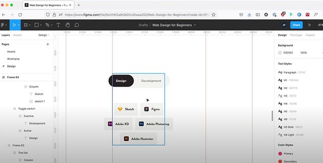
27. Let’s Design Some Tabs
Based on the wireframes, the tab control we need to design is in the about page and its purpose is to present the tools that Robert Fox is using for design and for development.
Common Patterns: Accordion Controls
28. Definition and Use Cases for Accordions
Ok, let’s talk about accordions. In UI design, these are very similar to tab controls in the sense that content is split up in multiple panels which can be opened by the user.
29. Let’s Design an Accordion
Based on the wireframes, our accordion is for a Q&A section inside the contact page. So let’s get to it.
Common Patterns: Contact Forms
30. Definition and Use Cases for Contact Forms
I’m sure we don’t really need a definition for this pattern right? It’s pretty self-explanatory. It’s a web form that people can use to contact you.
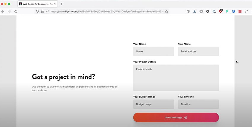
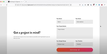
31. Let’s Design a Contact Form
Ok so based on the wireframe, the contact form is placed in the… contact page. Imagine that. So let’s get started.

Responsive Web Design
32. What is a Responsive Website?
Alright, let’s talk about responsive websites and I want to start by telling you a short story.
Related links:
33. Making Layout Changes for Tablet and Phone
Ok so first let’s see what kind of problems our layouts are facing when displayed on a smaller screen and then we’ll think about solutions.
34. Making a Component Responsive
Making a website responsive is not a very difficult task, but every now and then you will stumble upon a certain UI element that’s going to give you a hard time, for example, a table.
We don’t have any tables in this design, but we have tabs. And these can sometimes prove to be problematic as well so in this lesson I’ll show you how to make the tab component responsive.

Conclusion
35. A Quick Word About Prototyping
So what is a prototype? Well, it’s basically an interactive mockup of your design. It doesn’t necessarily mean the final version of the design, but instead a version that allows you to better see the functionality and the user’s journey through the website.
36. Next Steps and Key Takeaways
Well, this was a big course. 36 lessons, over 3 hours long, and a lot of hopefully useful information. So congrats for finishing it, I hope you learned something new and if you have any questions or feedback please leave a comment down below.
